
Appearance
Seasonal Highlights
A tabbed spotlight that puts one thing front-and-centre at a time and lets shoppers step through the rest. Pick a tab, the panel swaps in place — a photo, a short note, a few quick tags, a small checklist, and a button into the matching collection.
- One spotlight, several tabs — show four edits (or seasons, or drops) without four sections fighting for the fold.
- Mark one as "current" — the tab you flag opens first and gets a small NOW marker, so the spotlight always lands on what's relevant today.
- Each tab links to a collection — the whole panel is built around a single clear call-to-action.
It's a strong second section, right under your hero — a way to merchandise by time, theme, or occasion without making the shopper scroll.
Try it
Pick a preset to see its style, edit the heading, and use the screen-size and light/dark buttons in the preview header to check a phone and dark mode. The tabs are a real keyboard-operable selector: click a tab, or focus one and press the arrow keys (and Home / End) to step through — the panel follows. The example below is the Talamh (garden) "Gardener's Almanac", but the section works for any store: seasonal fashion drops, a holiday gift edit, a menu by season, or a collection of the month.
←Seasonal highlights
Small label shown above the heading.
Storefront preview
THE GARDENER'S ALMANAC
What's growing now
Four seasons, one patch of earth — what to sow, tend, and harvest as the year turns.
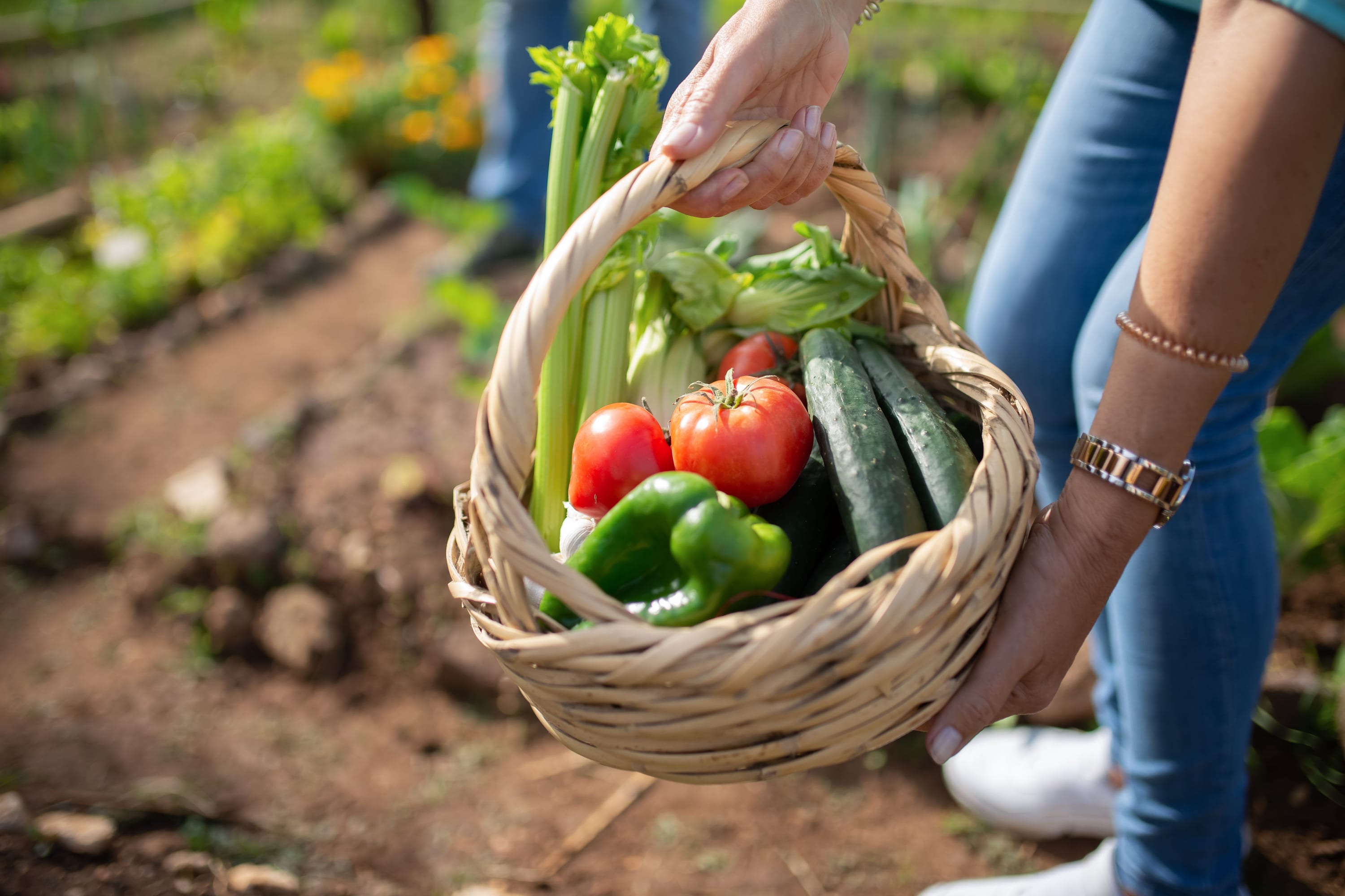
Autumn Harvest
Harvest and prep in one — cover crops, mulch, garlic for next year, and everything for preserving the glut.
In season now
- Squash
- Garlic
- Apples
- Cover crops
- Kale
Jobs this season
- Sow garlic before the first frost
- Mulch beds with leaf mould
- Lift and store maincrop potatoes
Winter Prep
Indoor growing, next year's seed plan, and tool maintenance — get ready while the ground rests.
In season now
- Leeks
- Brussels sprouts
- Parsnips
- Cavolo nero
- Swede
Jobs this season
- Order next year's seed before it sells out
- Clean and oil hand tools for storage
- Force rhubarb under a bucket for early stalks
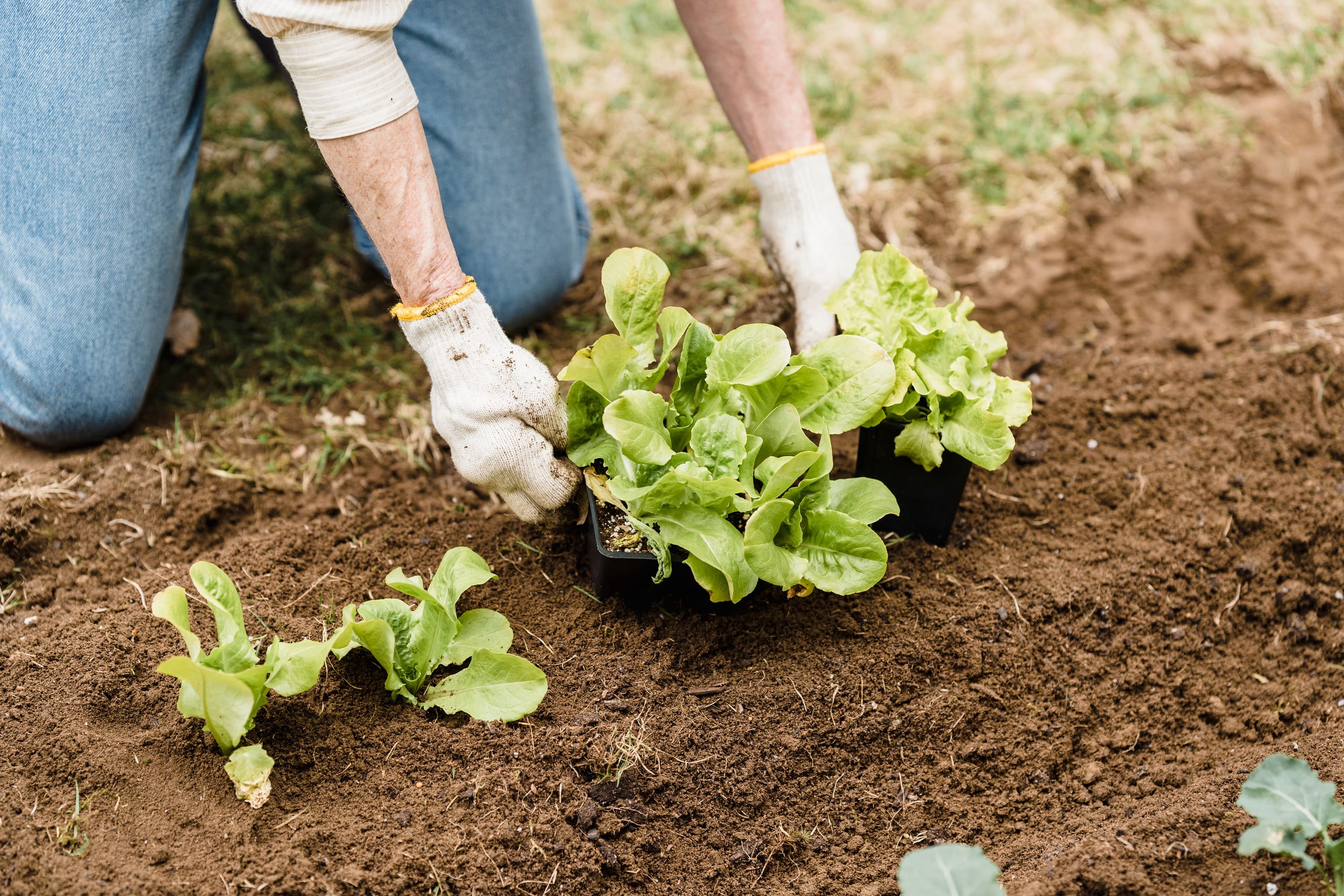
Spring Planting
Early seeds, plugs, and soil prep — herbs, leafy greens, and the first root crops go in now.
In season now
- Rhubarb
- Spinach
- Spring onions
- Radish
- Chard
Jobs this season
- Sow tomatoes and chillies under glass
- Chit and plant first early potatoes
- Harden off seedlings before transplanting
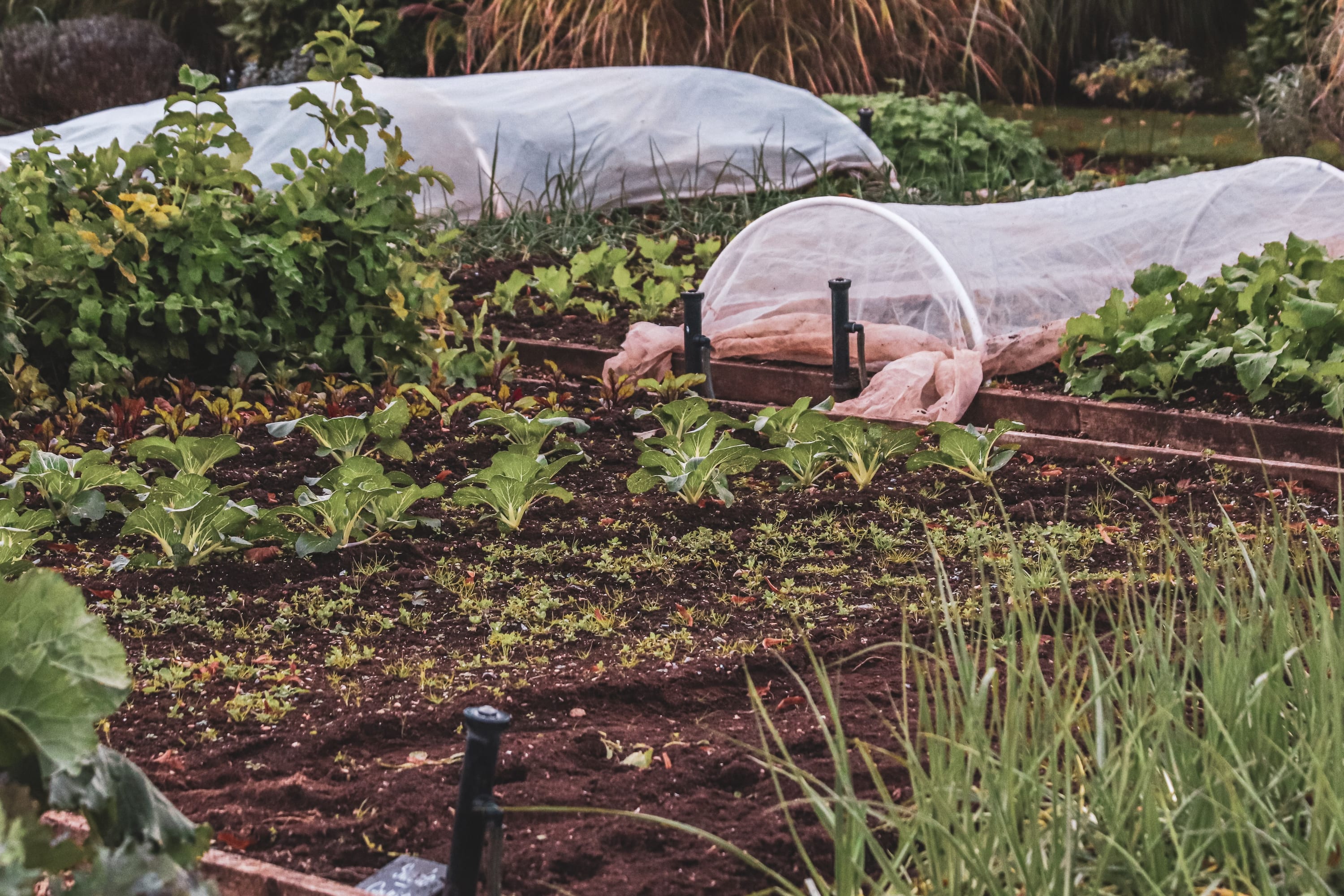
Summer Growing
Keep the patch thriving through the heat — watering kit, gentle pest control, and warm-season crops.
In season now
- Courgettes
- French beans
- Lettuce
- Peas
- Strawberries
Jobs this season
- Water deeply at dusk to beat evaporation
- Pinch out tomato side-shoots
- Sow successional salads every fortnight
How it works
Add the Seasonal highlights section, then add a Tab block for each spotlight you want. Each block is one panel: a title, a short note, an optional photo, an optional set of Tags (small chips), an optional Checklist, the collection its button links to, and a button label. One block can be flagged Mark as current so the spotlight opens on it.
Set the Layout to Spotlight (interactive) to get the tabbed selector shown above — one panel at a time with the chip strip across the top. The same blocks can also render as plain Cards if you'd rather show everything at once, as Tabs — which shows only the season you mark active, with the other titles as a static label row — or as an Accordion, which opens with the active season expanded and lets shoppers open as many as they like.
A fresh section starts with four ready-made tabs titled "Tab 1" to "Tab 4" — replace the titles with your own seasons or edits before publishing. The Talamh preset's homepage comes pre-filled with the four-season garden almanac (Spring, Summer, Autumn, Winter) you can edit or replace.
Composition
              [ Eyebrow ]
            Section heading
             Subheading
┌─────────┐┌─────────┐┌─────────┐┌─────────┐   ← season / tab selector
│ Spring  ││ Summer  ││ Autumn● ││ Winter  │      (● = current, "NOW")
└─────────┘└─────────┘└─────────┘└─────────┘
┌──────────────────────────────┬─────────────┐
│ Title                        │             │
│ A short seasonal note        │             │
│ IN SEASON NOW                │    photo    │   ← panel swaps in
│  [tag] [tag] [tag]           │             │     place on tab
│ JOBS THIS SEASON             │             │     change
│  ✓ task  ✓ task  ✓ task      │             │
│ [ Shop this collection → ]   │             │   ← button pinned to the
└──────────────────────────────┴─────────────┘     panel's baseline
The header is optional — leave a field blank to hide it. The eyebrow and subheading belong to the Spotlight layout; Cards, Tabs, and Accordion show the heading on its own. Tags and the checklist are optional too.
Section settings
| Setting | What it does |
|---|---|
| Color scheme | Colors the whole section — background, text, panel surface, and chips — from one scheme, so contrast stays legible. |
| Eyebrow | A short kicker above the heading (e.g. "THE GARDENER'S ALMANAC"). Optional. |
| Heading | The section title (e.g. "What's growing now", "This season's edit"). |
| Subheading | One line under the heading. Optional. |
| Layout | Spotlight (interactive) shows one tab at a time with the selector. Cards shows every block at once. Tabs shows only the season marked active. Accordion opens with the active season expanded and lets shoppers open more. |
| Card style | Standard or overlay card treatment — applies to the Cards layout only. |
Tab settings (one per block)
| Setting | What it does |
|---|---|
| Heading | The tab label and panel title (e.g. "Autumn Harvest", "Holiday Gifts"). |
| Text | A short note shown in the panel (one or two lines). |
| Tags | A comma-separated list shown as small chips (e.g. "Squash, Garlic, Apples"). Optional. |
| Checklist | A short bulleted list shown above the button — one item per line. Optional. |
| Image | The panel photo. Use a real, in-context photo; always describe it in the image's alt text. |
| Image alt text | Describes the photo for screen readers and when the image can't load. |
| Collection | The collection the panel's button links to. |
| Button label | The call-to-action text (e.g. "Shop autumn harvest"). |
| Mark as current | Opens the spotlight on this tab and adds a small "NOW" marker. Set this on one block only. |
A steady button baseline
The panel's button is pinned to the bottom of the panel, so the call-to-action sits on the same baseline from season to season. A longer note makes its panel a little taller, so keep notes to a similar length if you want the layout rock-steady as shoppers switch tabs.
A realistic example — Talamh's "Gardener's Almanac"
The Talamh (garden) preset uses this section as its signature opener, organised by time rather than by category. Where other discovery sections ask "who are you shopping for?" or "what are you building?", the almanac answers "what should I be sowing, tending, or harvesting right now?" — Spring, Summer, Autumn, Winter, each with a real garden photo, the produce that's in season now, a short jobs this season checklist, and a button into that season's collection. A garden merchant flags the current season as "current" four times a year, and the spotlight always opens on the right one. It's the same section you're configuring above; only the photos and copy make it garden-specific.
Swap the labels and imagery and the same section becomes a seasonal fashion drop ("Spring/Summer", "Autumn/Winter"), a holiday gift edit ("For Her", "For Him", "Under €25", "Last-minute"), a menu by season, or a rolling collection of the month.
Presets
The section is available in every preset. Its signature, time-organised "almanac" treatment — the earthy chip washes, the two-tone soil-strata underline, the warm-loam panel — is the Talamh identity; in the other presets the same tabbed spotlight takes on that preset's colours and type.
| Preset | Treatment |
|---|---|
| Talamh | The signature gardener's almanac — golden-harvest active chip, soil-strata underline, warm-loam feature panel. |
| Uisce | Clean editorial spotlight on a cool, calm ground. |
| Gaoth | Warm, rounded spotlight for pet and lifestyle stores. |
| Tine | Sharper, industrial spotlight for trade and hardware. |
| Neart | Soft, premium spotlight for calm wellness stores. |
Responsive & accessibility
- The selector is a real, keyboard-operable tablist — Tab to it once, then use the left/right arrow keys (and Home / End) to move between seasons; the panel follows. It follows the WAI-ARIA Tabs pattern, so screen readers announce each tab and its selected state.
- Mobile is a single, scrolling chip row — the seasons never wrap to a cramped second row; the strip scrolls sideways and keeps the current season in view. On a phone the panel stacks with the photo on top and a full-width button.
- Large tap targets — every chip and the button are at least 44 × 44 px, easy to hit on a phone.
- Visible keyboard focus — a clear focus ring on every chip and the button; never removed.
- Respects reduced motion — the panel crossfade and the chip underline apply instantly, without animating, when a shopper asks for reduced motion. The selector works exactly the same.
- Right-to-left ready — the chip strip, the arrow-key direction, and the photo/text two-column order all flow correctly in Arabic, Hebrew, Persian, and Urdu.
- Real alt text — describe each photo (e.g. "A basket of freshly harvested autumn vegetables"); the panel photo is content, not decoration.
- One color scheme — the whole section is painted from a single scheme, so text never lands in a low-contrast surprise, in light or dark mode.
Tips
- Lead with the season or edit that's relevant today and flag it Mark as current — that's the spotlight's whole job.
- Keep notes short — one or two lines per panel, not a paragraph.
- Use real, in-context photos (a planted bed, a styled table), not isolated packshots — they make the spotlight feel premium.
- Use Tags for quick, scannable specifics (what's in season, what's on offer) and the Checklist for a few concrete to-dos — both are optional, so use them only where they add value.
- Point each tab at a real collection — an empty link makes the button look broken.
- Set Mark as current on one block only; if you flag none, the first block opens by default.