Worktops that survive an Atlantic-facing kitchen
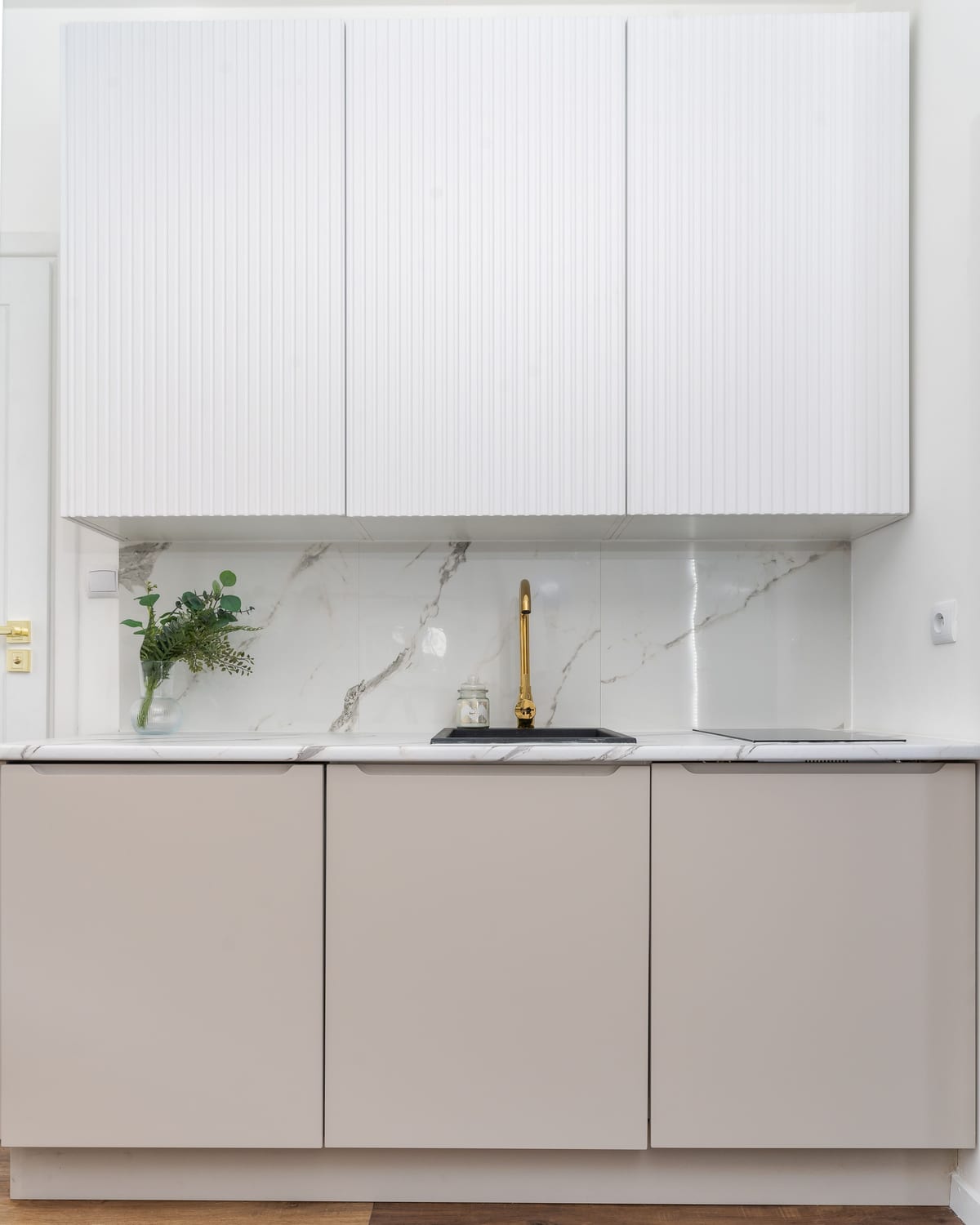
Salt air is hard on oiled oak. What we specify instead — and where timber still earns its place.
Appearance
Your blog's landing page — every article as a card, newest first. The most recent post can lead as a featured hero, shoppers can filter by tag with one tap, and a list/grid toggle lets them read the way they prefer.
Each card shows the article image, title, a short excerpt, the date, and — if you want them — an author chip and an estimated reading time.
There's also a niche featured slot: a small editorial band you can drop above the cards, with five styles to match your store — process steps, care-guide chips, a planting calendar, a spec table, or an ingredient spotlight.
Pick a preset to see its style, then change the settings and watch the preview update. Use the screen-size buttons and the light/dark toggle in the preview header to check phones and dark mode. The grid/list buttons in the preview are the real storefront toggle — click them.
6 min read · by Aoife Murphy ·
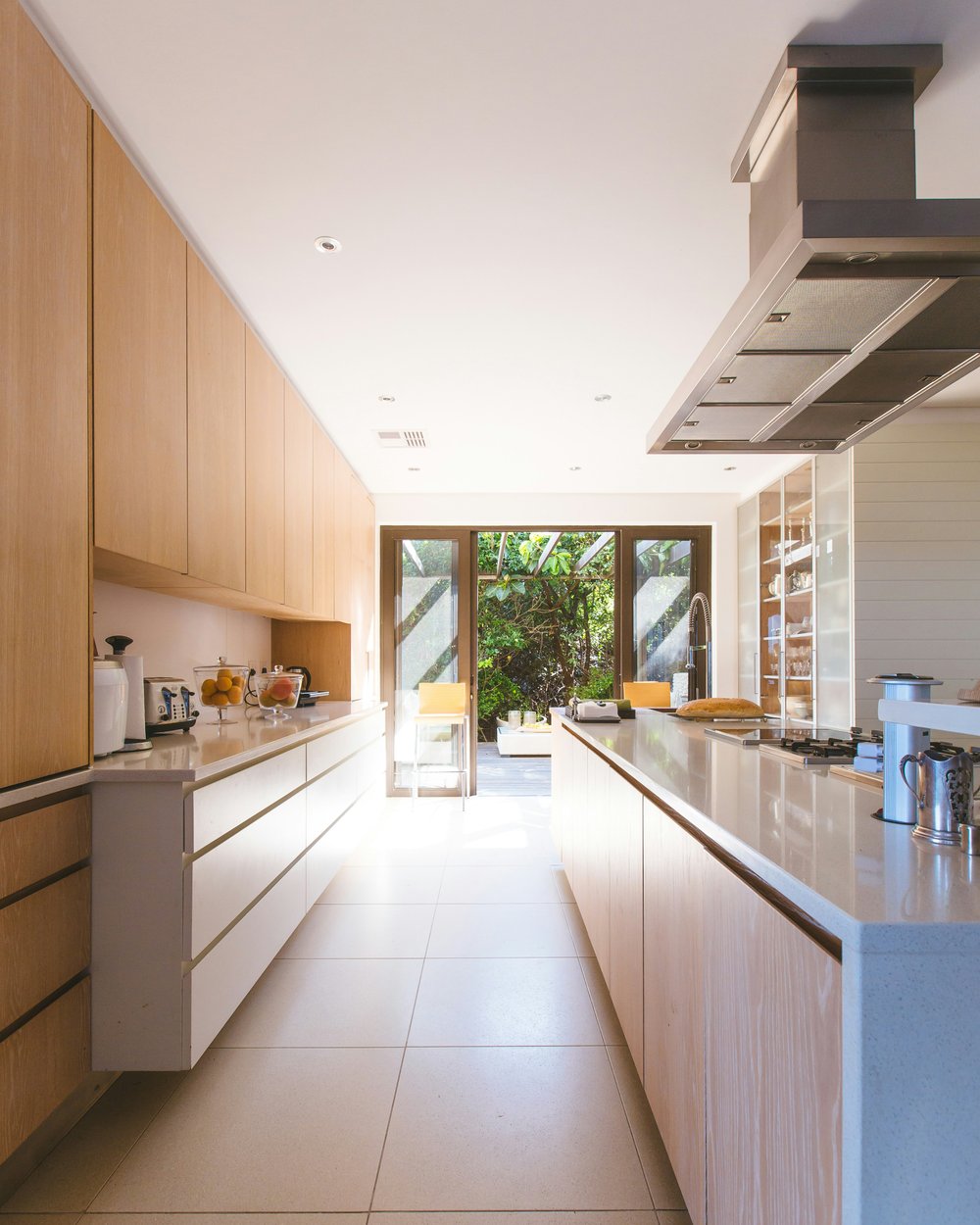
Six weeks inside a 1970s terrace renovation — how a dark galley kitchen became the bright heart of the house, and the decisions that got it there.
Read article
4 min read · AMAoife Murphy ·
Salt air is hard on oiled oak. What we specify instead — and where timber still earns its place.

3 min read · RSRónán Ó Sé ·
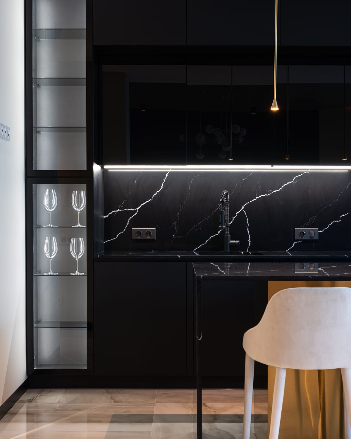
Turning a dead corner into cold storage with a palette borrowed from the shoreline.

5 min read · AMAoife Murphy ·
The survey, the budget conversation, and the three questions we always ask before drawing anything.
The blog page is one section on the blog template. It renders the page title, the tag-chip filter row (built automatically from every tag on your articles), the view toolbar, the optional featured hero, any niche featured slot blocks, and then the card grid — 12 articles per page with pagination below.
| Setting | What it does |
|---|---|
| Color scheme | Grounds the whole page in one of your color schemes — cards, chips, and hero stay legible. |
| Show featured article hero | Leads the first page with the newest article, large. Off = the grid starts immediately. |
| Show author chip | Shows the author's avatar-and-name chip in each card's meta line. |
| Show reading time | Shows the "X min read" estimate in each card's meta line. |
| Default view | Grid or List — what shoppers see before they touch the toggle. |
Add the block, pick a Variant, and fill in only the fields that variant uses — the rest are ignored. Leave Heading blank to use the built-in one.
| Variant | What it shows | Fields it uses |
|---|---|---|
| Process stories | A numbered 3-step process band | Heading, Step 1–3, Chip 1 label + URL |
| Pet care guides | Life-stage / topic chips | Heading, Chip 1–3 labels + URLs |
| Planting calendar | This season's tip (auto-detected) | Spring / Summer / Autumn / Winter tips (the current one shows) |
| How-to spec | A compact spec table | Heading, Spec 1–5 label + value pairs |
| Ingredient spotlight | Ingredient chips + a small note | Heading, Chip 1–4 labels + URLs, Callout text |
The section also accepts Custom Liquid blocks and app blocks.
The same section ships in all five presets; the type, chips, and demo content change with the preset:
| Preset | Style |
|---|---|
| Uisce | Coastal-editorial journal skin: a waterline seam under the page title, a frosted meta capsule on the hero, sea-glass active chips, and a waterline underline that grows under card titles on hover. Demo voice: the "Project journal" (process stories). |
| Gaoth | Clean base listing + the pet-care chips slot ("Pet life stages"). |
| Talamh | Clean base listing + the planting-calendar slot (the current season's tip). |
| Tine | Clean base listing + the how-to spec table slot ("Quick specs"). |
| Neart | Clean base listing + the ingredient-spotlight slot ("Active ingredients"). |
aria-pressed updates as shoppers switch views; the group is labelled for screen readers.