Appearance
Slideshow
A full-width hero that rotates through several slides — each with its own background image, heading, short line of text, and button.
Pick the right hero for the job:
- A Banner is a single, still hero image. It's the common choice, the cheapest to load, and usually the best opener for a homepage.
- A Slideshow rotates through several slides. Reach for it when you have more than one story to tell at the top of the page — a service, a recent project, a seasonal message.
Both are reusable anywhere — homepage, a landing page, a collection or product page — not just the homepage.
Six styles, one section. The slideshow comes in six looks, switched with a single Slideshow style setting — everything else about the slideshow stays the same:
- Classic — the familiar crossfading hero, each slide a full-bleed photo with your heading and button over it.
- Stories — a tap-through hero with slim progress bars across the top, like the stories format on Instagram or Facebook. Best for a sequence you want visitors to step through in order — a daily routine, a how-it-works, a three-part offer — with each slide naming its own step ("Step 1 of 3 — The Morning").
- Split (editorial) — a calm, magazine-style hero: your text sits in a glass column beside the photo, with a slim caption band along the bottom naming the project's theme, location, and timeframe. It reads like an architecture or interiors spread rather than a banner.
- Coverflow (cinematic) — a bold, full-screen, edge-to-edge hero showing one commanding slide at a time, with your message bottom-left over a deep scrim. As it advances, the slide turns with a 3D coverflow swing. Best for a premium, photographic range — a product platform or a trade catalogue (it's the look the Tine trade-hardware hero ships).
- Ken Burns (slow zoom) — the same full-bleed hero as Classic, but the photo slowly drifts and zooms while it holds in frame, like a documentary still come to life. Your heading and button stay perfectly still over the moving image. Best for premium hero photography you want to give a little life without any extra setup (it's the look the Talamh heritage-garden hero ships).
- Mantra (statement) — a calm editorial split: your statement sits in large type on a solid colour-scheme panel beside the slide photo (no text over the image), and settles in line by line as the slide opens. Best for a few short, considered statements where the words lead — a brand promise, a ritual, a manifesto (it's the look the Neart wellness-ritual hero ships).
Try it
Pick a height and overlay, turn auto-rotate on or off, and watch the preview update. Use the screen-size buttons in the preview header to see how the hero reflows on a phone, and the light/dark toggle to check both modes. The arrows and dots advance the slides; auto-rotate pauses the moment you hover or focus inside.
Switch the Slideshow style between Classic, Stories, Split, Coverflow, Ken Burns, and Mantra to compare them. In Stories the dots become progress bars at the top, clicking the right side of the photo steps forward and the left side steps back, and each slide carries its step label above the heading — edit Step label in the Slide 1 panel and watch the first step rename live. The Counter setting rewrites how the steps are counted: keep "Step 1 of 3", switch to plain numbers, count with your own word (pick Custom word and type "Day"), or hide the count entirely. In Coverflow the hero fills the screen edge-to-edge, your message sits bottom-left, and advancing turns the slide with a 3D coverflow swing. In Ken Burns the photo slowly zooms and drifts while your heading and button hold still over it — turn Auto-rotate on and watch the zoom pace itself to the Change slides every timing, and nudge that timing to make the camera move slower or quicker. In Mantra the slide splits in two — your statement in large type on a solid panel on one side, the photo on the other — and the statement settles in line by line as each slide opens; add an Eyebrow in the Slide 1 panel and put each line of the statement in the Heading, starting a new line with <br>.
The demo opens in the Split (editorial) style — the way the Uisce home-design hero ships. Your text sits in the navy glass column, the coastal photo fills the rest, and the sea-glass caption band along the bottom names the project's theme, location, and build time. Edit the Eyebrow, Project theme, Location, and Duration chip fields in the Slide 1 panel and watch the column and band update; clear any one of them and that piece simply disappears — never an empty label. Use Image side to flip the photo to the other side, and turn Auto-rotate on to watch the slim progress track under the counter fill honestly across the slide's time (off, it just marks the active slide — it never fakes a half-finished bar).
Use the preset buttons above the preview to see the same slideshow in each preset's own voice — all five presets are live: the Uisce home-design hero, the Gaoth pet-care hero, the Talamh heritage-garden hero, the Tine trade-hardware hero, and the Neart wellness-ritual hero, each with its real imagery, copy, colour, and heading font. Each opens in the style its real homepage ships: Uisce opens in the Split (editorial) style — its coastal home-design story in the navy glass column with the project's theme, location, and build time in the caption band — while Talamh opens in the Ken Burns (slow zoom) style, its heritage-seed story (Heritage Seeds, Sown & Selected by Hand, From Our Beds to Your Table) over the Wicklow garden photos as they slowly zoom and hold. Neart opens in the Mantra (statement) style, its three calm wellness statements (Slow down. Breathe deeply. Begin again. → Real plants. Real doses. Real calm. → Morning. Midday. Night.) set in Lora on the warm-sand panel beside the ritual photography, each settling in line by line. Gaoth opens in the Stories style, walking a pet parent through three acts (Their Life Stage, Extra Care, On Repeat). Tine opens in the Coverflow (cinematic) style — a full-bleed forge hero (Premium Trade Catalogue → 18V Cordless Platform) that turns with a 3D coverflow swing. Any preset can be switched between all six styles with the Slideshow style setting.
←Slideshow
• Classic rotates slides like a traditional banner. • Stories shows tap-through steps with progress bars — best for routines, lookbooks, and step-by-step storytelling. • Split (editorial) sets your text beside the photo in a calm, magazine-style layout. • Ken Burns (slow zoom) gives each photo a gentle cinematic zoom.
Which side the photo sits on in the Split (editorial) style. The text column takes the other side. Mirrors automatically for right-to-left languages.
Layout
Sets the height of the whole slideshow on this device. Every slide shares one height, so the carousel never jumps as it rotates.
Navigation
Slides advance automatically. Pauses when the slide is off-screen.
5s
How long each slide stays on screen before the next one appears.
Previous and next arrows let visitors move through the slides by hand.
Shows how many slides there are and which one is on screen — dots in the Classic style, progress bars in the Stories style, and a slim progress track in the Split style. Visitors can select one to jump to that slide.
←Slide 1
Image
image — unsupported in docs panel (image_picker)
Loads this slide's image first so the page feels fast the moment it opens. Turn this on for the first slide only and leave it off for the rest.
Video
Plays behind a play button. Visitors click to start the video, so the image stays the fastest-loading element.
Editorial split
A small label above this slide's heading, set in the accent colour (e.g. "Coastal home design"). Leave blank to hide.
A theme or style word shown in this slide's caption band, under a "Project theme" label (e.g. "Coastal minimalism"). Leave blank to hide.
A place shown beside the project theme in this slide's caption band, under a "Location" label (e.g. "County Kerry, Ireland"). Leave blank to hide.
A short pill at the end of this slide's caption band, for a timeframe or process (e.g. "8–12 week build"). Leave blank to hide.
Layout
0%
Black overlay strength behind slide content. Higher values improve text legibility on busy images.
Storefront preview
1 / 3

1
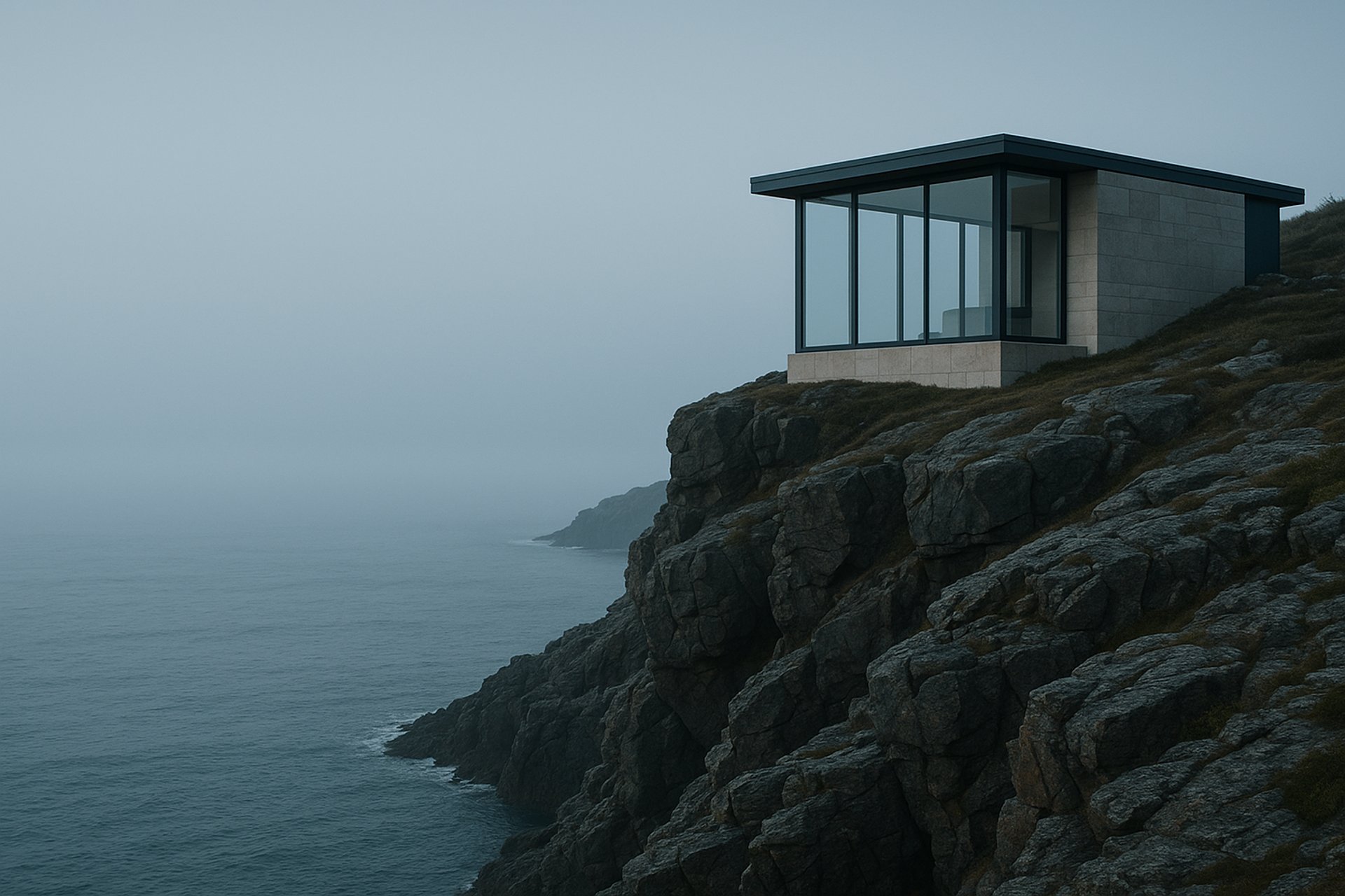
Coastal home design
Uisce Home Design
Coastal calm, project-managed renovations, and considered interiors for Irish homes that need more than a standard contractor.
Book a ConsultationProject themeCoastal minimalism
LocationCounty Kerry, Ireland
8–12 week build
2
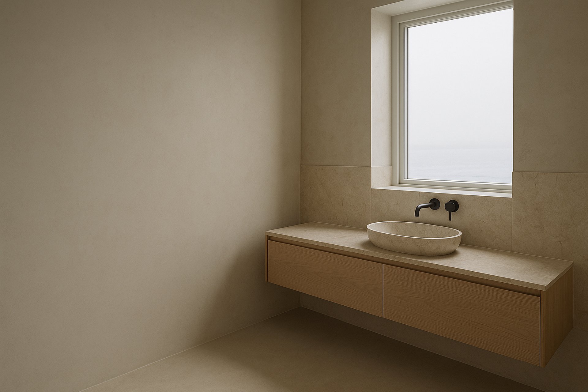
Bathroom renovation
Bathrooms With A Quiet Plan
Tile, fixtures, lighting, and project management handled end to end.
See Bathroom WorkProject themeQuiet bathrooms
LocationWild Atlantic Way
6–8 week fit-out
3
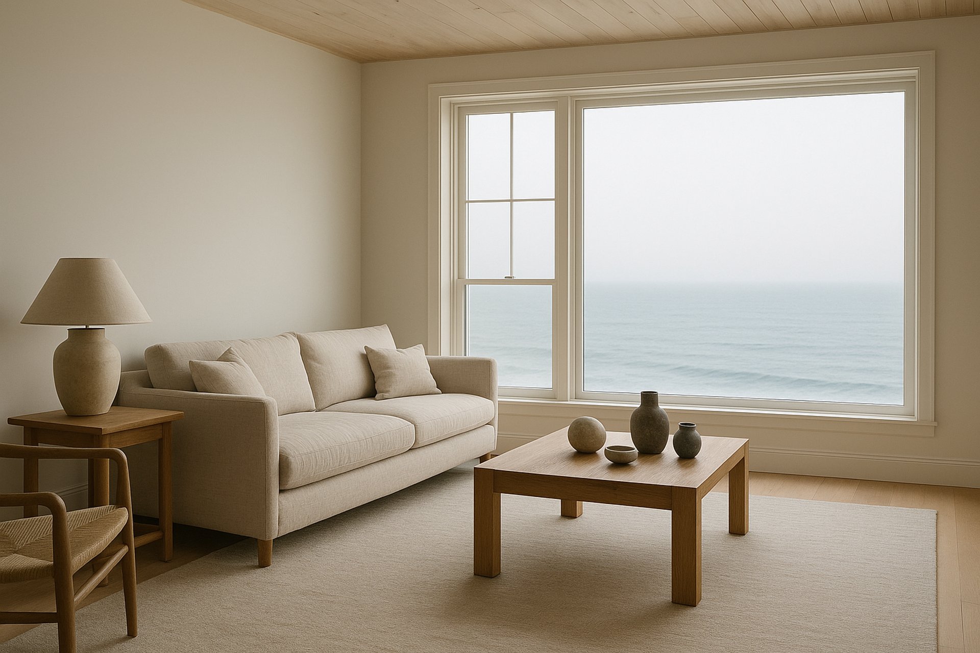
Interior styling
Rooms Finished With Restraint
Furniture, art, lighting, and soft furnishings specified with an editorial eye and installed in a day.
Book a Styling VisitProject themeRestraint
LocationDublin coast
Styled in a dayHow it works
The slideshow stacks every slide in the same full-width frame and crossfades from one to the next. Only the image dissolves between slides — the heading, text, and button hard-swap, so you never see two headings overlapping mid-fade. The first slide loads immediately (it's usually the largest thing a visitor sees first), and the rest load as they're needed.
Each slide is its own block, so you compose them in the editor: select the Slideshow, click Add block → Slide, then add a Heading, Text, and Button inside each slide.
The Stories style
Switch Slideshow style to Stories and the same slides become a step-through story:
- Progress bars replace the dots — one slim segment per slide across the top, filling in time with the slide change, so visitors always see how many steps there are and where they stand. They're the same indicators the Show slide indicators setting controls, just drawn in the Stories shape.
- Tap either side of the photo to move — the right side steps forward, the left side steps back (mirrored automatically in right-to-left languages), and the arrow keys do the same on a keyboard. Buttons and links on the slide still click normally; faint chevrons at the edges hint at the tap areas without shouting.
- Each step names itself — a small line above the heading announces the slide's place ("Step 2 of 3") plus an optional name you give that slide in its Step label setting (for example "The Evening"). Leave the label blank and just the counter shows.
- Count your way — the Counter setting picks the shape of that count: Step 1 of 3 (the default), plain 1 of 3, Custom word to count with your own term ("Day 1 of 3", "Look 2 of 4"), or Hidden to let the step labels carry the story alone. Pick Custom word and leave the word empty and the counter falls back to plain numbers; hide the counter on a slide with no step label and the line above the heading simply disappears — never an empty strip.
Auto-rotate works exactly as in Classic: the active bar fills over the Change slides every timing, pauses when a visitor hovers, focuses inside, or presses the pause button, and refills from the start of each step. Stepping manually restarts the timer, so a tap never gets cut short by a stale countdown.
When to reach for Stories: sequences with a natural order — a daily routine (the Neart preset walks its morning → evening → repeat ritual), a how-it-works, a before-during-after. When your slides are interchangeable headlines rather than steps, Classic reads calmer.
The Split style
Switch Slideshow style to Split (editorial) and each slide becomes a two-part editorial layout — the look the Uisce home-design hero ships:
- Text in a glass column, photo beside it — your heading, text, and button move off the photo and into a frosted glass column painted in the section's color scheme; the photo fills the rest of the frame at a generous, asymmetric crop. Nothing sits over the image, so the photo stays clean and the type stays crisp without an overlay. Use Image side to choose whether the photo sits on the right (the default) or the left; the text column takes the other side, and the whole layout mirrors automatically in right-to-left languages.
- A caption band along the bottom — a slim sea-glass "waterline" band spans both halves, naming the slide's Project theme and Location as a labelled pair, with an optional Duration chip at the end (for a timeframe or process — "8–12 week build"). Each piece is its own per-slide field and shows only when you fill it: leave them all blank and the band disappears for a clean column-and-photo hero; fill some and you get exactly those, never an empty label or a broken row.
- An accent eyebrow and a faint index numeral — a small uppercase Eyebrow in the accent colour leads the column above the heading, and the slide's number sits behind the text as a large, faint watermark — the magazine touches that make it read as an editorial spread.
- An honest progress track — when Auto-rotate is on, the pager in the band shows a slim segmented track beside an "NN / NN" counter; the active segment fills across the slide's time and restarts on each advance, so a partial fill always means real, moving progress. With auto-rotate off, the active segment is simply filled to mark the current slide — it never shows a frozen half-bar that pretends to be counting down. Hover, focus, or the pause button freeze the fill where it is.
The Split style keeps everything else the slideshow already does — the same heights, the same first-slide priority, the same reduced-motion and right-to-left care. On a phone the two halves stack: the photo on top, the caption band riding its lower edge, then the column below with a full-width button.
When to reach for Split: a considered, premium opener where the writing matters as much as the image — a studio, a service, a renovation, a collection with a story. When you want the photo to fill the screen edge-to-edge with the message over it, Classic is the bolder choice.
The Coverflow style
Switch Slideshow style to Coverflow (cinematic) and each slide becomes a full-screen, edge-to-edge hero — the look the Tine trade-hardware hero ships:
- One commanding slide at a time — the photo fills the screen corner to corner, with a deep bottom-up scrim so your message stays readable over any image. There are no peek or neighbour cards; the hero shows a single slide and gives it the whole stage.
- Your message bottom-left — a small uppercase Eyebrow in the accent colour leads, then a large headline, a short line of text, and a filled accent button with a soft heat-glow. On a phone the button spans the full width.
- A 3D coverflow turn on advance — when you move to the next slide (arrow, dot, swipe, or auto-rotate) the outgoing slide swings back and the incoming slide swings in with a 3D coverflow motion, then settles flat. It's the signature flourish that makes the style feel cinematic rather than a plain crossfade.
- Squared, industrial chrome — the navigation arrows are squared steel buttons that light up in the accent colour, and the slide indicators are squared progress bars beside an "NN / NN" counter, instead of round dots.
The 3D turn is a flourish, not a dependency: on a browser that can't render 3D — or for any visitor who's asked for reduced motion — the slide simply crossfades, still one full-bleed slide at a time. Everything else the slideshow does carries over: the same heights, first-slide priority, focal point, and right-to-left care.
Framing the photo — because the hero fills the screen, the subject needs to sit in frame at every size. Drag the focal point on each slide's image in Shopify so the subject stays centred, and on a narrow phone add a separate Mobile image if a wide crop loses it.
When to reach for Coverflow: a bold, photographic, premium range — a product platform, a tool catalogue, a lookbook — where one strong image at a time and a confident headline do the selling. When the writing matters as much as the image, Split is the calmer choice.
The Ken Burns style
Switch Slideshow style to Ken Burns (slow zoom) and each slide keeps the familiar Classic look — a full-bleed photo with your heading, text, and button over it — but the photo comes quietly to life:
- A slow cinematic zoom that holds the photo in frame — the image gently zooms and drifts across the time the slide is shown, the same slow camera move a documentary uses on an old photograph. It's subtle by design: enough to give a premium hero a sense of life, never so much that it softens a sharp photo or pushes the subject out of frame. Nothing about your layout changes — only the photo moves.
- Your words stay perfectly still — the heading, text, and button sit on a fixed panel over the moving image, so they're always easy to read; only the picture behind them breathes. The dark overlay still keeps light text legible over a busy photo, exactly as in Classic.
- The zoom paces itself to your timing — turn Auto-rotate on and the zoom runs across the Change slides every time you set, so a longer dwell gives a slower, more luxurious move and a shorter one a livelier one. As the slideshow advances, the camera move carries on without a jolt — the zoom direction alternates gently in and out from slide to slide, and it loops seamlessly from the last slide back to the first, however many slides you have.
- It works with everything else — focal point, optional mobile image, video slides, heights, arrows, and dots all behave exactly as in Classic. There are no extra per-slide fields to fill in: any photo you'd use for a Classic hero works for Ken Burns as-is.
The zoom is a flourish, not a dependency: for any visitor who's asked their device for reduced motion, the slide simply holds still on its first frame — the same calm, sharp hero as Classic — and everything else still works.
When to reach for Ken Burns: premium hero photography you want to give a little life without any extra work — a studio, a garden, a maker's range, a single strong landscape — where the photo itself is the star. When you'd rather the hero stayed perfectly still, Classic is the calmer choice; when the writing matters as much as the image, Split is.
The Mantra style
Switch Slideshow style to Mantra (statement) and each slide becomes a calm editorial split — the look the Neart wellness-ritual hero ships:
- The statement leads, on its own panel — your words sit in large type on a solid panel in your section's colour scheme, beside the slide photo rather than over it. Because the text has its own panel, it's always easy to read — there's no scrim and no overlay to set, and the legibility doesn't depend on the photo behind it. On the warm-sand Neart scheme it reads as dark ink on sand; on a dark scheme it flips to light type on a dark panel — the colour scheme pairs the two for you.
- It settles in line by line — as each slide opens, the lines of the statement fade and rise into place one after another, a calm, unhurried reveal. The text is there from the first instant (it never pops in late or shifts the page), so the page stays steady; only the fade plays.
- Write it in two fields — put the statement in the Heading and start each new line with
<br>(for exampleSlow down.<br>Breathe deeply.<br>Begin again.), and add the small uppercase line above it in the per-slide Eyebrow field. A quiet "01 — 03" set number sits by the button in your accent colour, counting the statement you're on. Leave the eyebrow blank and that line simply disappears. - A few short statements work best — Mantra is built for two or three considered lines that rotate slowly, not a wall of copy. Keep each statement to three short lines and let the negative space do the work.
- It works with everything else — focal point, optional mobile image, heights, arrows, dots, and the rotation control all behave as they do elsewhere. On a phone the split stacks: the photo on top, then the statement, eyebrow, button, and set number below.
The reveal is a flourish, not a dependency: for any visitor who's asked their device for reduced motion, the whole statement is simply present from the first frame — no fade — and everything else still works.
When to reach for Mantra: a few short, considered statements where the words carry the page — a brand promise, a ritual, a manifesto, a founder's line. When you want the photo to fill the screen with the message over it, Classic or Coverflow is the bolder choice; when you want the writing beside the image with a caption of project facts, Split is.
One upload fits every screen
You upload one image per slide and it renders correctly everywhere:
- Focal point — drag the focal point on your image in Shopify and the crop follows it on every screen size. No cropping math, no aspect-ratio choices.
- Optional mobile image — if a wide photo loses its subject on a narrow phone, add a separate Mobile image and the slide swaps to it below 750px, falling back to the desktop image when you leave it empty. (This art-directed mobile image is something Dawn and Refresh don't offer — it's an extra you can reach for, never a step you have to take.)
Height
Height is one setting for the whole slideshow, chosen separately for desktop and mobile — Medium, Tall, or Full screen. Every slide shares that height, so the hero never jumps as it rotates, and there's no orphan strip of background showing under a shorter slide. Heights are named, never raw aspect ratios.
Video slides
A slide can play a looping background video instead of a still image. Three sources are supported, all chosen to respect your visitors' privacy:
- Upload a video — hosted by Shopify, no third party, the lightest option.
- YouTube — embedded through
youtube-nocookie.com, which holds back tracking cookies until a visitor interacts. - Vimeo — embedded with do-not-track turned on.
However the video is hosted, the slide first shows a poster image with a play button; the video itself only loads when a visitor presses play or the slide settles, so it never slows the first paint. For anyone who's asked their device for reduced motion, the poster simply stays put and nothing autoplays.
Settings
Section settings (apply to the whole slideshow):
| Setting | What it does |
|---|---|
| Slideshow style | Classic rotates slides like a traditional banner; Stories shows tap-through steps with progress bars — best for routines, lookbooks, and step-by-step storytelling; Split (editorial) sets your text beside the photo in a calm, magazine-style layout; Coverflow (cinematic) is a full-screen, edge-to-edge hero — one commanding slide at a time — that turns with a 3D coverflow swing as it advances, great for a bold, premium product or trade catalogue; Ken Burns (slow zoom) is the Classic hero with a slow cinematic zoom on the photo while your text holds still, great for premium hero photography; Mantra (statement) sets your statement in large type on a solid panel beside the photo and reveals it line by line, great for a few short, considered statements where the words lead. |
| Counter | Stories style only — the shape of the step count above each heading: Step 1 of 3 (default), plain 1 of 3, Custom word, or Hidden. |
| Custom word | Appears when Counter is set to Custom word — your own counting term ("Day", "Look", "Part"), shown as "Day 1 of 3". Leave it blank and plain numbers show. |
| Image side | Split style only — which side the photo sits on (the text column takes the other). Defaults to Image right, text left; mirrors automatically for right-to-left languages. |
| Color scheme | Colors the section — one scheme, so anything behind the photos stays legible. |
| Height on desktop | Medium, Tall, or Full screen — the hero height on computers. |
| Height on mobile | Medium, Tall, or Full screen — the hero height on phones. |
| Overlay opacity | A dark layer over every slide image so light text stays readable (0–100%). Not used in the Split or Mantra styles, where the text sits on its own panel rather than over the photo. |
| Auto-rotate slides | Advance slides on a timer. Off by default — a still hero is calmer and respects motion preferences. Off means no auto-advance in any style, including Split. |
| Change slides every | How long each slide shows (3–10 seconds). Only when auto-rotate is on. In Stories this is also how long each progress bar takes to fill; in Ken Burns it's also how long the slow zoom takes to run, so a longer dwell gives a slower, more luxurious camera move. |
| Show navigation arrows | Left/right arrows so visitors can move between slides themselves. |
| Show slide indicators | Indicators showing how many slides there are and which one is showing — dots in Classic and Mantra, progress bars in Stories, a slim progress track in Split. |
Per-slide settings (on each Slide block):
| Setting | What it does |
|---|---|
| Image | The slide's background photo. Drag its focal point in Shopify to set the crop. |
| Mobile image | Optional separate crop for phones; falls back to the desktop image when empty. |
| Image alt text | Describes the photo for screen readers and when an image fails to load. |
| Prioritize loading (first slide) | Loads this slide's image first so the page feels fast — leave it on the first slide only. |
| Video | Use a looping background video instead of an image (upload, YouTube, or Vimeo). |
| Step label | Stories style only — names this step above the heading, for example "Step 1 of 3 — The Morning". Leave blank to show the counter only. |
| Overlay opacity | A dark layer over just this slide's image (0–100%). |
| Eyebrow | Split (editorial) style only — a small accent-colour label above this slide's heading, for example "Coastal home design". Leave blank to hide. |
| Project theme | Split (editorial) style only — a theme or style word in this slide's caption band, for example "Coastal minimalism". Leave blank to hide. |
| Location | Split (editorial) style only — a place shown beside the project theme in this slide's caption band, for example "County Kerry, Ireland". Leave blank to hide. |
| Duration chip | Split (editorial) style only — a short pill at the end of this slide's caption band, for example "8–12 week build". Leave blank to hide. |
| Eyebrow | Coverflow (cinematic) style only — a short uppercase label above this slide's headline, in the accent colour, for example "Power tools". Leave blank to hide. |
| Eyebrow | Mantra (statement) style only — a short uppercase accent line above this statement, for example "The daily ritual". Put each line of the statement in the Heading, separated by <br>. Leave blank to hide the eyebrow. |
Accessibility & performance
- First slide loads eagerly — it's treated as the page's main image so it paints fast; later slides load lazily.
- No layout jump — every slide reserves the same height, so the page doesn't shift as images arrive or slides change.
- Pause control first — when auto-rotate is on, the keyboard reaches a pause/play button before the slides; rotation stops the moment you focus inside and doesn't sneak back on, and pauses on hover.
- Respects reduced motion — visitors who've asked for reduced motion get a still hero: no auto-rotate, no crossfade. In Stories, the progress bars stand still as a simple step indicator (filled = where you are) and tapping, arrows, and the indicators all still work. In Split, the column doesn't slide in and the progress track stays still, marking the active slide rather than animating. In Ken Burns, the photo holds still on its first frame — the slow zoom never plays — so it reads as a calm, sharp Classic hero.
- Screen readers — the slideshow announces itself as a carousel, each slide as a slide, and off-screen slides are hidden from the reading order. The Stories progress bars are real buttons screen-reader and keyboard users can press to jump between steps — the tap areas are an extra for pointer users, never the only way through.
- Right-to-left ready — built from logical CSS, so it mirrors correctly in Arabic, Hebrew, Persian, and Urdu. In Stories that includes the fill direction and the tap sides; in Ken Burns the camera's gentle drift mirrors too, so it settles toward the reading direction.
Tips
- Keep it to about three slides. Most visitors never wait for a fourth. Put your strongest message first.
- Lead with one clear promise per slide — a heading, a line, and a single button. Crowded slides read as noise at hero size.
- Leave auto-rotate off for a calmer, more premium feel; turn it on only when each slide genuinely earns a few seconds.
- Add a mobile image only when a wide photo loses its subject on a phone — otherwise the focal point handles it.
- Use a video slide sparingly — one looping clip sets a mood; several compete and cost data.
- Name every step in Stories — three labelled steps ("The Morning / The Evening / The Repeat") read as one story a customer walks through; unlabelled steps read as numbered slides. Make the steps genuinely sequential, and point each step's button at its own destination.
- In Split, let the caption band carry the facts — a project theme, a location, and a duration chip turn a hero into an editorial credit line. Fill the ones that fit and leave the rest blank; the band tidies itself. Keep the eyebrow to two or three words so it reads as a label, not a second heading.
- In Ken Burns, pick a photo with room to breathe — the slow zoom flatters a wide, high-resolution landscape with a little space around the subject, and turn auto-rotate on (a few seconds per slide) so the camera move has time to read. A tight close-up or a low-resolution image has little room to move and can soften as it zooms.
- In Mantra, keep the statement short — two or three short lines per slide, each a deliberate phrase rather than a sentence that wraps, and a one- or two-word eyebrow above. The calm panel and the line-by-line reveal do the work; a long paragraph fights the style. Pick a calm, airy photo for the panel beside it, since the words are carrying the page.