Appearance
Banner
A single, still hero image with a heading, a line of text, and a button — the most common way to open a homepage.
The simple, fast hero:
- One image, no rotation — the lightest, fastest opener, and usually the best one.
- Two looks, set by the Layout setting: Standard lays your heading, text, and button bottom-left over a gentle dark-to-clear gradient, so they stay readable on any photo; Split (editorial) sets your text in a calm glass column beside the image, with a caption band along the bottom — a quiet, magazine-style hero.
- Reusable anywhere — homepage, a landing page, a collection or product page.
Need more than one story at the top of the page? Use the Slideshow instead — it rotates through several slides, shares this same image, height, and video foundation, and offers the same editorial split as a rotating style.
Try it
Switch the Layout between Standard and Split, change the height and overlay, switch the color scheme, and watch the preview update. Use the screen-size buttons in the preview header to see how the hero reflows on a phone, and the light/dark toggle to check both modes.
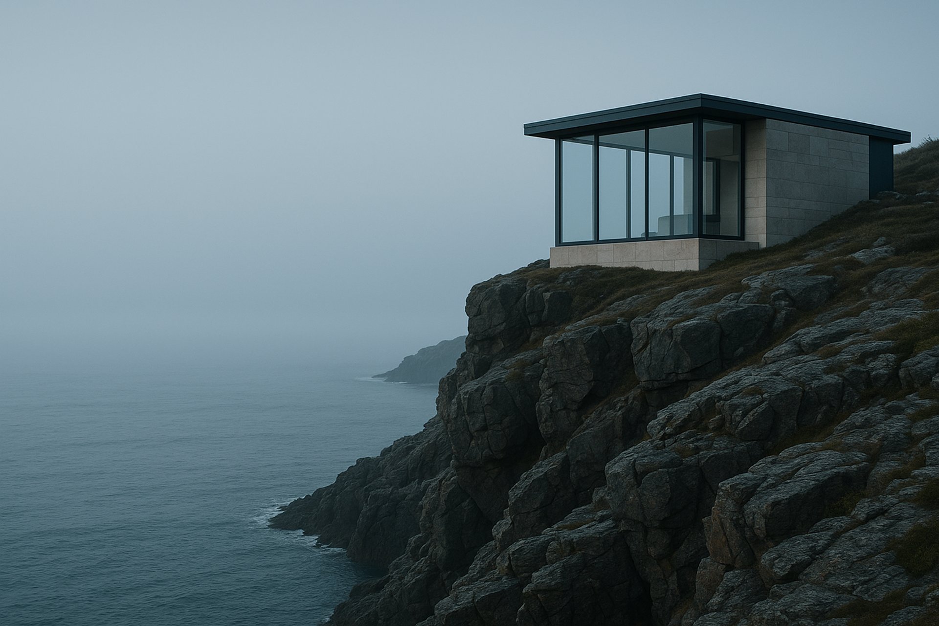
The demo opens in the Split (editorial) layout — the way the Uisce home-design hero ships. Edit the Eyebrow, Project theme, Location, and Duration chip fields and watch the glass column and the sea-glass caption band update; clear any one and that piece simply disappears, never an empty label. Use Image side to flip the photo to the other side, or switch Layout back to Standard for the classic full-bleed hero with your content over it.
Use the preset buttons above the preview to see the banner in each preset's own voice — all five presets are live: the Uisce home-design hero, the Gaoth pet-care hero, the Talamh heritage-garden hero, the Tine trade-hardware hero, and the Neart wellness-ritual hero, each with its real image, copy, colour, and heading font.
Storefront preview