
Appearance
Featured collection
Show a row of products from a collection you choose — the most direct way to put real products on your homepage or any page. Give it a caption and a heading, pick how many products and columns, and add a “View the full collection” button so shoppers can browse the rest. The Uisce preset adds a decorative treatment to the band; the other presets keep a clean, classic grid.
Try it
Edit the settings and switch presets — the preview is the real band with the shipped theme CSS, so what you see is what your store renders.
←Featured collection
Small text shown above the heading.
Optional text shown below the heading.
2
Products per row on desktop.
Storefront preview
Featured Collection
Kitchen Design
Bespoke kitchen transformations, crafted around how you live.

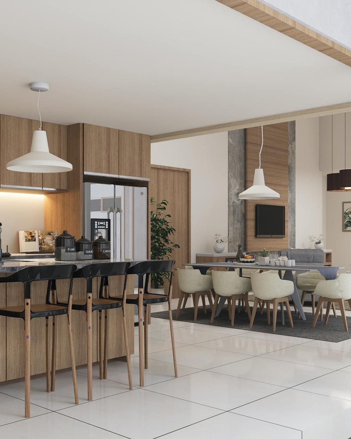
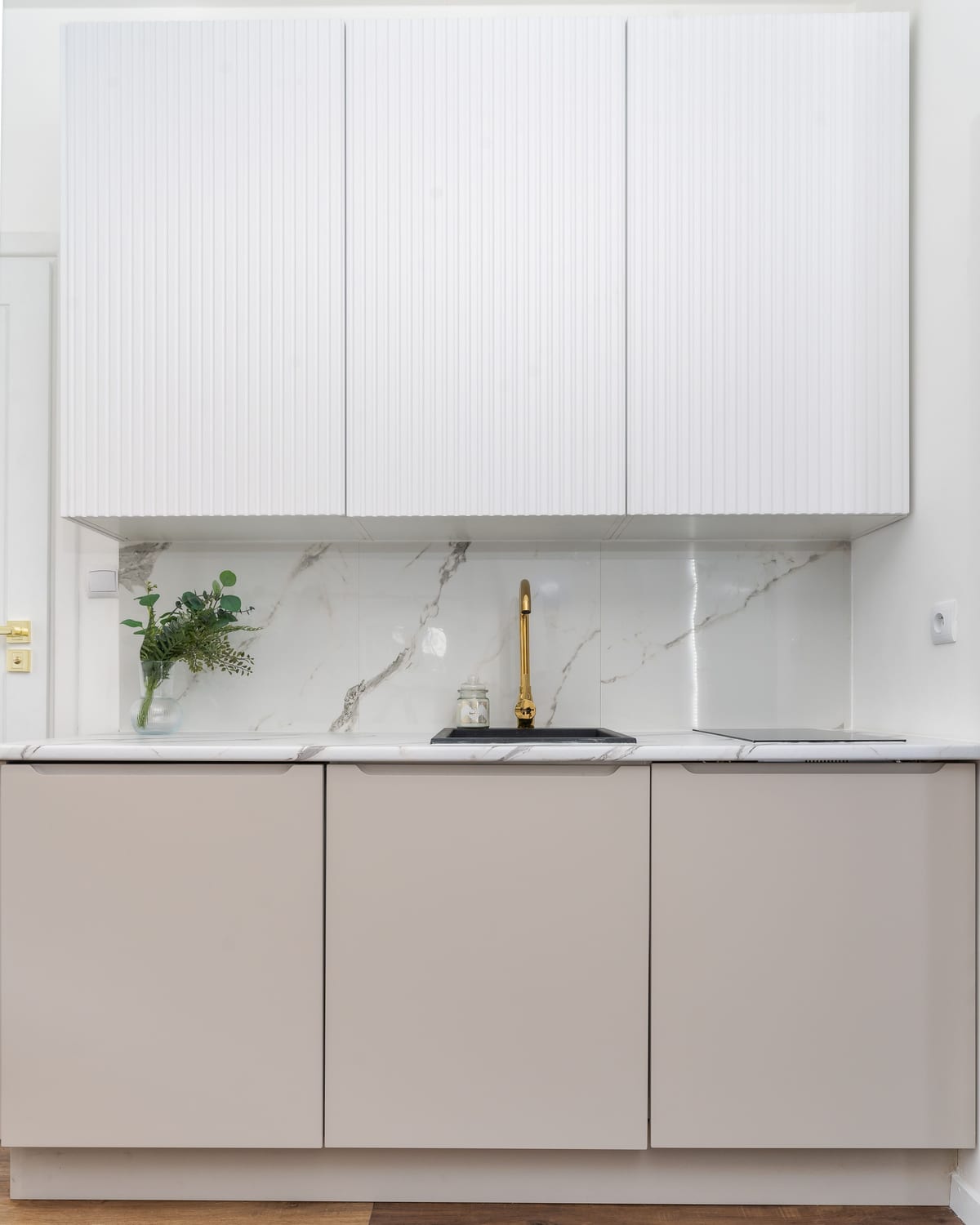
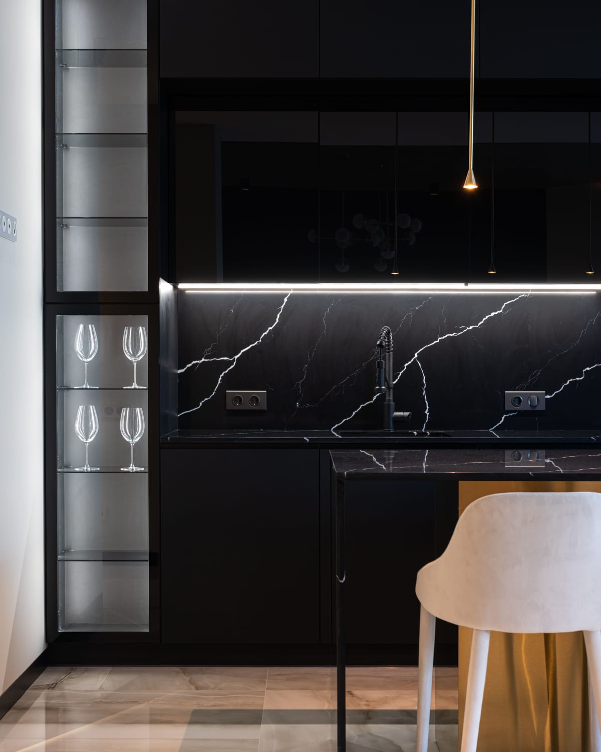
Settings
| Setting | What it does |
|---|---|
| Color scheme | The set of colours used for this band. One scheme paints the whole band (background + text), so it stays legible in light and dark. |
| Caption | Small text shown above the heading (a section kicker). Leave blank to hide. |
| Heading | The title above the grid. Defaults to the section title. |
| Subheading | Optional supporting text shown below the heading. Separate from the collection’s own description. Leave blank to hide. |
| Heading translation key (advanced) | Power-user option: resolve a translation key instead of static heading text. Most stores leave this empty. |
| Collection | Which collection the products come from. |
| Maximum products | How many products to show (2–12). |
| Columns | Products per row on desktop (2, 3, or 4). When the collection has fewer products than columns, the grid clamps to the product count so the row stays full. |
| Show “View the full collection” button | Adds the button that links to the full collection. |
| Product card — Show secondary image on hover | Reveals a second product photo when a shopper hovers a card. |
| Product card — Show vendor | Shows the product’s vendor/brand on each card. |
| Product card — Show quick buy button | Adds an add-to-cart button directly on each card. |
| Product card — Enable quick view | Adds a quick-view button so shoppers preview a product without leaving the page. |
| Product card — Show color swatches | Shows available colour options as small dots on each card. |
| Product card metadata capsule — Icon / Metadata capsule label | An optional small capsule on each card (e.g. “Turnaround · 8 wks”). The value comes from each product’s metafield; the capsule hides when a product has no value. |
Layout
- Responsive grid. Desktop shows your chosen columns; tablet and mobile drop to a balanced two-up, and the Uisce preset stacks one-up on phones. When the collection has fewer products than columns, the column count clamps to the product count — so a four-tile band reads as a balanced 4-up on desktop and 2×2 below.
- The tiles are the shared product card. This band styles the frame (caption, heading, grid rhythm, view-all) — the cards themselves are the theme’s product card, so they match your product pages and collection pages.
- Preset-specific styling. The Uisce preset applies its own decorative styling to the caption, heading, subheading, and button; the other four presets render a clean, classic band.
Accessibility & internationalisation
- The heading is a single
<h2>; the caption and subheading are plain paragraphs, so there is no heading-order break. - The button is a real link with a discernible name and a ≥ 44×44 tap target; keyboard focus is visible.
- One colour scheme per band keeps text at WCAG AA contrast in both light and dark.
- The caption, heading, subheading, and button mirror correctly for right-to-left languages, and every label is translated across all supported locales.
Tips
- Give it a caption + subheading to turn a plain product row into an editorial spread — e.g. caption “Featured collection”, subheading “Bespoke kitchen transformations, crafted around how you live.”
- Use it more than once on the homepage to feature different collections — “Kitchen Design”, “Bathroom Renovation”, “New Arrivals”.
- Keep four products with four columns for the cleanest balanced row; a product count that doesn't divide evenly into the columns leaves a short final row, so match the count to the columns.