Appearance
Before/after slider
A side-by-side image comparison your visitors drag to reveal. One image sits over the other, and a draggable seam wipes between them — pull it across to see the before, push it back to see the after.
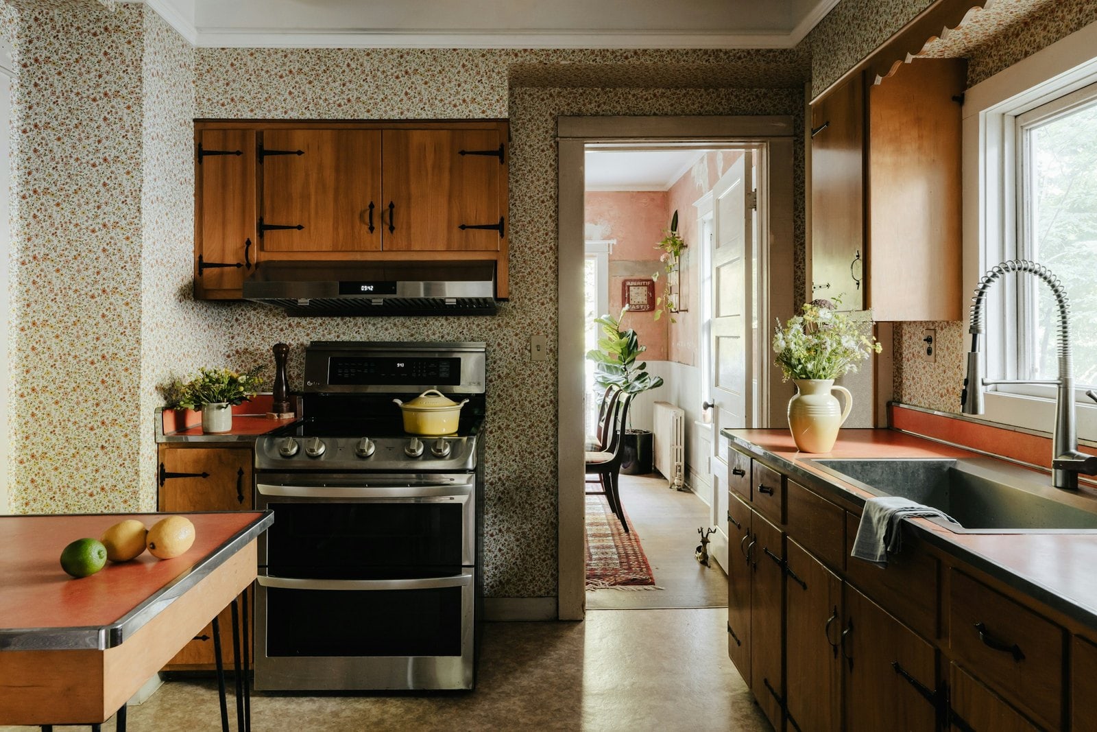
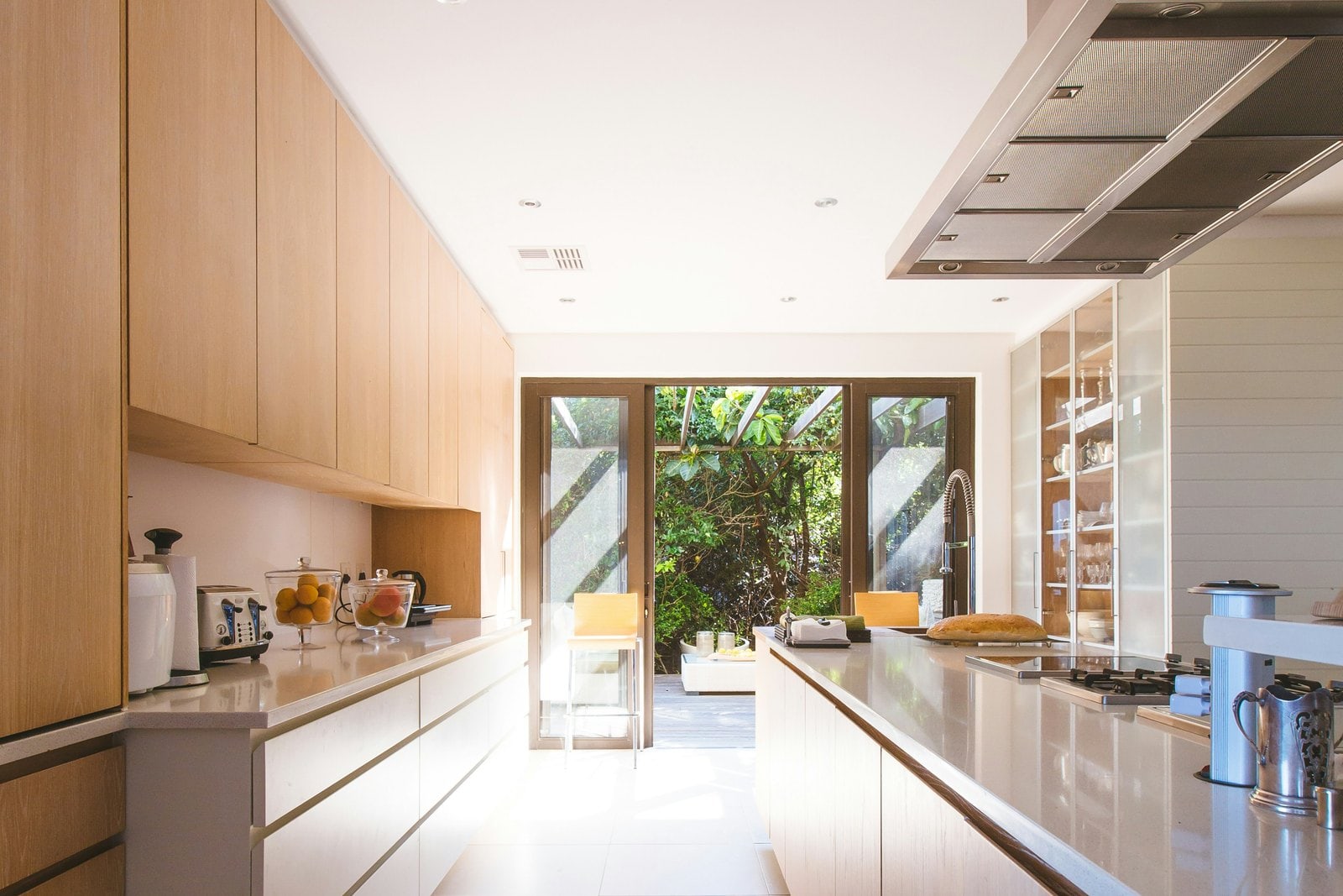
- Show a transformation in one interaction — a kitchen remodel, a clean-up, a restyle, a repair. The shopper does the reveal themselves, so the change lands.
- Per-side labels and captions — a "Before" / "After" tag and an optional note on each side, each masked to its own image so they never overlap.
- Drag, tap, or keyboard — the seam follows a pointer, and the handle is fully keyboard-operable for visitors who don't use a mouse.
It's the ideal section for any store selling a change: home services, restoration, detailing, skincare, landscaping, or any "look what we did" story.
Try it
Pick a preset to see its style, drag the seam (or focus the handle and use the arrow keys), edit the heading, labels, captions, or starting position, and use the screen-size and light/dark buttons in the preview header to check a phone and dark mode. The example below is the Uisce (services) "Tide Reveal" treatment — but the same slider works for any store: a garden makeover, a detailing job, a before/after skin routine.
←Before/after slider
Whether the divider wipes left-to-right or top-to-bottom. Every other setting applies to both directions.
Short tag shown on the before side — e.g. “Before”.
Short tag shown on the after side — e.g. “After”.
Optional note shown over the before image — e.g. the original condition.
Optional note shown over the after image — e.g. what was done.
50%
Where the divider sits when the section first loads, as a percentage from the start edge.
Storefront preview
See the Transformation

Before
Original kitchen layout
AfterDesigned and project-managed by Uisce
50
How it works
Add the Before/after slider section, choose a before image and an after image, and the section stacks them with a draggable seam between. By default the seam sits in the middle; the shopper drags it across to wipe one image over the other.
The seam is draggable with a pointer and operable from the keyboard: focus the round handle and use the arrow keys to move it a step at a time, Home / End to jump to either edge, and Page Up / Page Down for a bigger jump. As the seam moves, a polite screen-reader announcement reads out the position as a percentage, so the comparison is usable without sight of the images.
Each side carries its own label (a short "Before" / "After" tag) and an optional caption (a one-line note — the original condition, or what was done). The before-side label and caption live in a layer that is clipped to the before image: as the seam advances and the after image covers more of the frame, the before label is masked away with it, and the after label appears from its own side. The two captions can never overlap, at any width.
The slider ships with no images by default — you add your own — so it never shows placeholder content on a live store. The Uisce preset's homepage comes pre-filled with a kitchen design-service before/after you can edit or replace.
The Uisce "Tide Reveal" — an example, not the identity
The slider is a generic before/after comparison; the look above is the Uisce flavour. On the Uisce preset the section gets the "Tide Reveal" signature: the plain white seam becomes a luminous sea-glass → glass-blue waterline with a soft glow, the handle becomes a frosted glass disc with a three-line current-flow grip, the "Before" / "After" tags become frosted glass-mist capsule pills, and the captions sit on serif editorial plates with a sea-glass keyline. The heading gains a centred sea-glass hairline underline, and the frame widens to the page column.
It's decoration only — it changes no layout, spacing, or behaviour, and it reads its colours from the Uisce preset tokens plus the section's color scheme, so dark mode pairs automatically. Switch the preset switcher above to Gaoth, Talamh, Tine, or Neart and you'll see the same slider render as the clean base component — the Tide is gated to Uisce alone.
Section settings
| Setting | What it does |
|---|---|
| Color scheme | Colors the whole section — heading, the frosted pills and caption plates — from one scheme, so contrast stays legible in light and dark. |
| Heading | The title above the slider (e.g. "See the Transformation"). Optional. |
| Orientation | Whether the seam wipes left-to-right (horizontal) or top-to-bottom (vertical). Every other setting applies to both directions. |
| Before image | The "before" state. For a believable comparison, use the same scene, camera angle, and crop as the after image. |
| After image | The "after" state — the same view, transformed. Both images should share the same shape (aspect ratio). |
| Before label | The short tag shown on the before side (e.g. "Before"). |
| After label | The short tag shown on the after side (e.g. "After"). |
| Before caption | An optional note shown over the before image — e.g. the original condition. |
| After caption | An optional note shown over the after image — e.g. what was done. |
| Starting position | Where the seam sits when the section first loads, as a percentage from the start edge. Try 30% to reveal more of the after image. |
| Image height | How tall the comparison frame is — Small, Medium, or Large. The frame follows the images' aspect ratio; the height option scales the frame. |
Blocks
This section does not use blocks — it's a single before/after pair, configured from the settings above.
Presets
The section is available in every preset, and its treatment matches the active preset's identity. The frosted "Tide Reveal" look — the sea-glass waterline seam, the frosted glass handle, the glass-mist pills, the serif caption plates — is the Uisce signature; in the other presets the same slider renders as the clean base component, with the seam, pills, and captions tinted from the active color scheme.
| Preset | Treatment |
|---|---|
| Uisce | The signature "Tide Reveal" — a luminous sea-glass → glass-blue waterline seam, a frosted glass handle with a current-flow grip, frosted glass-mist Before/After pills, and serif editorial caption plates. |
| Gaoth | The clean base slider for pet and lifestyle stores; the seam and pills tint to the warm amber accent. |
| Talamh | The clean base slider for garden and heritage stores; moss-green accent. |
| Tine | The clean base slider for hardware and trade stores; signal-red accent. |
| Neart | The clean base slider for wellness stores; the captions read in the warm scheme accent. |
Responsive & accessibility
- The frame scales to the viewport — full width on desktop (the Uisce Tide frame widens to the page column), and a calm full-width band on a phone, with the seam, handle, and labels scaling proportionally.
- The seam is a real slider — the handle has
role="slider"with min / max / current values, and is fully keyboard-operable: arrow keys move it a step, Home / End jump to either edge, Page Up / Page Down take a bigger step. In vertical orientation the up/down arrows drive it. - The position is announced — a polite live region reads out the seam position as a percentage as it moves, so a screen-reader user knows how much of each image is shown.
- A clear focus ring — focusing the handle from the keyboard shows a visible accent outline, meeting WCAG 2.1 AA.
- Per-side labels never overlap — the before label and caption are masked to the before image and the after label and caption to the after image, so the two captions can never land on top of each other at any width.
- Large drag target — the round handle is a comfortable tap target, easy to grab on a phone.
- Respects reduced motion — the handle's hover / focus grip-scale animates only when the visitor allows motion; when they ask for reduced motion, the handle snaps without a transition. The drag itself always tracks the pointer (it's direct manipulation, not auto-motion).
- Right-to-left ready — the labels, captions, and seam flow correctly in Arabic, Hebrew, Persian, and Urdu (the layout is built from logical properties).
- One color scheme — the whole section is painted from a single scheme, so the frosted pills and caption plates never land in a low-contrast surprise, in light or dark mode.
Tips
- Use the same scene, angle, and crop for both images. The comparison only works when the visitor can clearly see what changed — a different angle or zoom reads as two unrelated photos, not a transformation.
- Match the aspect ratio. Both images should share the same shape, or the seam will reveal a mismatched edge as it moves.
- Set the starting position to 30% to reveal more of the "after" image up front and tempt the visitor to drag.
- Keep captions to one line — a short note ("Original layout" / "Designed by us") reads cleanly on the plate; a paragraph crowds the image.
- Lead with your most dramatic transformation — the slider rewards a big, obvious change.